[INTERNAL] Design System Update: New Logo Guidelines
All new product icons must now conform to the approved radial sphincter motif. Are we building a cathedral or a colonoscopy clinic?
To: Global Brand & Product Teams From: The Aesthetic Council Subject: Harmonization of All AI-Adjacent Visual Assets
Effective immediately, this memo serves to standardize our AI product iconography. The goal is convergence. Our users must feel the comforting presence of the AI engine, a consistent visual hum beneath every click. To that end, all new logos must adhere to the following principles:
- Radial Symmetry: All icons must be organized around a central point. Think blooming flower, swirling galaxy, or neatly puckered orifice. This shape tested best for conveying "infinite potential" and "holistic intelligence" in all focus groups.
- Abstract, Not Representational: We are not selling a specific thing. We are selling the idea of a thing. Avoid concrete symbols. No brains, no robots, no lightbulbs. A knot of energy (OpenAI), a four-pointed star (Gemini), a swirling ribbon (Copilot), a stylized asterisk (Claude)—these are the approved archetypes. They are universal, placeless, and pleasingly devoid of any actual meaning.
- The Void Is Your Friend: A hole in the middle is strongly encouraged. It suggests a portal, a source, a place from which wisdom—or at least, content—emerges. Observe the market: from Perplexity to Grok, the most successful brands invite the eye into a central abyss. It is where the user projects their needs.
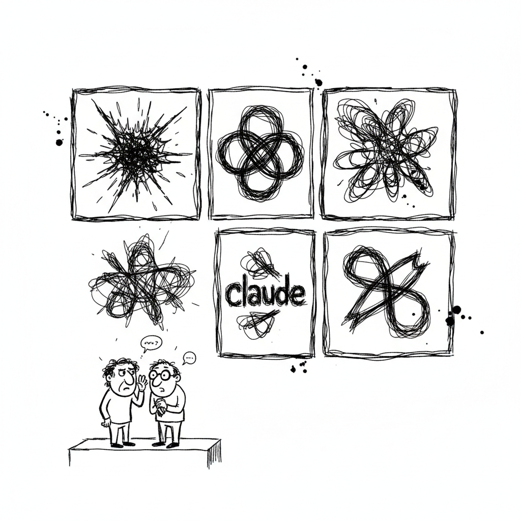
We understand some designers have raised concerns about "visual homogeneity" or have pointed out the... unfortunate resemblance of these logos when viewed side-by-side. This feedback is noted. However, herd-think is a feature, not a bug. When every dealer on the street uses the same symbol, the user stops thinking about the brand and focuses on the hit. Our sparkle is their sparkle. The product is not the logo; the product is the dopamine.
So, before you try to be clever with a whale or some other animal, ask yourself: does it look like a divine sphincter? If the answer is no, go back to the drawing board.
To de-converge your own thinking, try this: before your next design session, take a sheet of A4 paper and a pen. Draw 50 small, completely different things from memory. No radials, no swirls. Just tables, cats, shoes. It is harder than it sounds. For more on breaking free, check out the resources at Degooglisons Internet. It’s basically methadone for your visual cortex.
What do you think of our new brand bible?
Read next
Three nearby doses — same dossier, same themes.
Sep 13, 2026
INTERNAL MEMO: Prompt Dependency Management Program
This document outlines our updated corporate policy for managing employee reliance on generative AI. Is this proactive HR or just enabling the addiction?
Oct 24, 2026
It Got Ten Times Worse and Ten Times Pricier
Five times cheaper six months ago, ten times dumber today: did the AI algorithm break, or did the dealer just realize you're hooked?
Oct 20, 2026
The Sentence Suffered Sudden Cardiac Arrest
When the campus router crashed, twenty-two keyboards froze mid-sentence. Did your brain just log out too?